
How well can the market predict the next Bank of Canada rate hike?
By Kevin Dribnenki, Contributing Columnist, Fixed Income Derivatives at TMX, Montreal Exchange
Published: 25 October 2017
Given the Bank of Canada’s (BoC) recent rate hike, the first since mid-2010, and the first rate hike delivered by the current Governor; we visit the evolution of the BAX term structure and examine how well it has predicted BoC monetary policy action over the past decade. Investors unfamiliar with the “spaghetti plots” presented here and how to interpret them can refer to a brief explanation in the Appendix.
Predictive capacity of the market
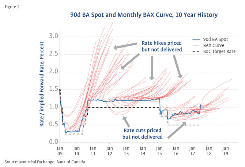
The term structure of the BAX market has been a poor predictor of actual BA rates over the past decade as we will see in Figure 1. For active investors, this is a beneficial feature of markets as it has provided opportunities to outperform.
Figure 1
Source: Montréal Exchange, Bank of Canada
We can see in Figure 1 that the red “spaghetti” lines which represents the BAX curve[1] each month for the past decade, have been consistently above the blue 90d BA spot line for nearly the entire period.
The most prominent exceptions have been the two periods where the BAX curve predicted BoC rate cuts between late 2011 and mid-2012 as well as mid-2015 to mid-2016. These rate cuts weren’t delivered in both cases but are obvious in Figure 1 as the red lines are well below the blue.
Another prominent exception occurs around late 2009 and early 2010 when the BAX curve predicted a series of rate hikes that were ultimately delivered but perhaps earlier or more quickly than the market had priced.
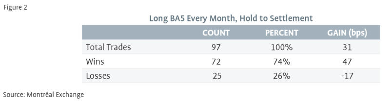
Easy rolldown
The consistent market pricing of rate hikes that are not delivered[2] has created past opportunities that have been exploited by active investors. For nearly a decade, active, leveraged investors have been able to buy, for example, the 5th BA contract and hold it to cash settlement for an easy rolldown trade, as the predicted rate hikes failed to come from the BoC. In fact, as tabulated in Figure 2, an investor could have done this trade 97 times since the start of 2009 and notched up a winning trade percentage of 74%, averaging gains of 31 basis points (bps) per trade after subtracting the losses[3] on losing trades.
Figure 2
Source: Montréal Exchange
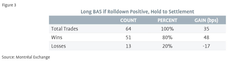
If an investor had resolved to do the trade only when the expected rolldown was positive (i.e. rate cuts were not priced at the time of the trade), he or she could have racked up an 80% winning streak and averaged +35 bps per trade, as shown in Figure 3.
Figure 3
Source: Montréal Exchange
While we’ve described the above strategy as “Easy Rolldown,” the active investor was taking risk and was rightly rewarded for recognizing that a BAX curve that prices aggressive rate hikes was an anomaly worth exploiting.
Opportunity or end of an era?
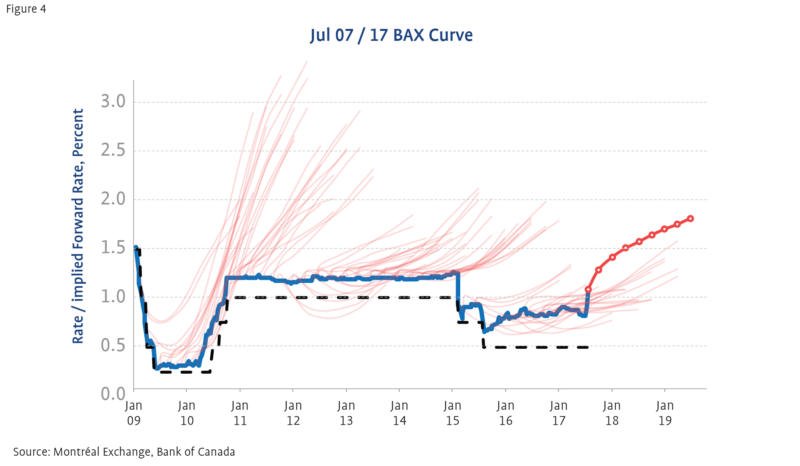
The Easy Rolldown trade came to an abrupt end in the last month as spot (and forward) BA rates rose rapidly on communications from the BoC. The question now is whether the persistent anomaly of forward curves are again pricing more aggressive policy tightening than will be delivered…or if the current forwards, with at least three rate hikes priced into the BAX contracts in the next two years, as shown in Figure 4, will be realized.
Figure 4
Source: Montréal Exchange, Bank of Canada
We note three observations from the past decade that investors should take into consideration when making their decision:
Spot BA rates have not risen that much in comparison to the hiking cycle of 2010 as is evident from Figure 1. The recent “pain” in the BAX rolldown trade stems largely because forwards were very flat prior to the BoC changing their bias last month.
Even in the most recent, albeit brief, hiking “cycle” of 2010, rising spot rates were generally priced before the actual change in the BoC target rate. The market predicted much more aggressive rate hikes than were actually delivered through most of that cycle.
If investors refer to Figure 5 in the Appendix, they may note a similarity between the BAX curve today and the BAX curve on July 20th, 2011. The July 20th, 2011 term structure predicted slightly more policy tightening than the BAX curve today but it is notable that those hikes were not delivered by the BoC since, within a month, external factors[4] repriced BAX contracts as well as many other markets. The 5th contract yield fell by almost 100 basis points in a single month as the BAX term structure swung from pricing several rate hikes to pricing several rate cuts, entirely due to factors exogenous to Canada’s economy.
Appendix: Interpreting the “spaghetti plot” of BAX
While the charts presented here can seem complex and overly busy, they attempt to convey a great deal of historical information in a relatively accessible manner. Generally, the charts show the term structure of the BAX curve every month for the past 10 years and give a good visual indication of whether the market has been an accurate predictor of Bank of Canada policy[5].
To begin to interpret the “spaghetti” we can examine Figure 5 where we have accentuated the BAX curve on July 20th, 2011 relative to the other curves. Here, without as much noise from the other curves on different dates, we can see the bright red term structure of BAX forward rates emerging from the spot (blue) 90d BA rate. The first eight BAX contracts are all shown in the red line and represent the predicted (forward) 90d BA rate for the next two years starting at the expiry date of each contract. For example, the 5th BA contract on July 20th, 2011 is shown in green.
One can readily determine that a buy-and-hold investor who bought that contract on July 20th, made roughly 60 basis points of profits if they held the contract to cash settlement because the contract yield fell (green arrow) from 1.8% to 1.2% (the spot rate 15 months later, blue line) over the life of the contract as rate rises that were priced into the term structure were not delivered by BoC policy.
To speak more generally, when the red “spaghetti” is above the blue spot line, an investor made money by being long the BA contracts in the term structure and profited from the passage of time as the forward rate rolled down to the spot rate. The multitude of red lines in Figure 1 are simply the BAX curve generated once per month for the past 10 years and plotted together on the same x-axis.
In some cases, the blue spot line is above or rises through the red BAX curve lines which indicates a period of time where being passively long the BAX contract was a money losing trade.
Figure 5

Source: Montréal Exchange, Bank of Canada
[1] These forward curves utilize only the first eight BAX contracts, the fronts (whites) and reds. Greens (the next four contracts) are also traded but have less open interest and clutter the chart without adding any additional insight.
[2] Or, occasionally but not as reliably, rate cuts that are not delivered.
[3] Note that the final 12 entry points have not settled yet. Many of them would have lost due to the recent rise in spot BA rates and they are included in this analysis for the sake of accuracy. Since cash settlement prices are not yet known, they are marked to market as of July 7th, 2017.
[4] On August 6th, 2011 S&P downgraded US Treasuries leading to fears of additional contagion from the European sovereign debt crisis. The S&P fell more than 6% on August 8th and European stock markets fell even further in some cases. Easy monetary policy followed from almost every central bank in the world, including Canada’s.
[5] Active managers hope for markets that are poor predictors of the future as that creates opportunities to add value by monetising a market view different from the consensus.